CONNECTED | May 22, 2026
Talking about typography in new library exhibition Pressing Importance

While the nation is celebrating the 250th anniversary of the American Revolution, and Salem is commemorating the 400th anniversary of its European settlement, PEM is illuminating Salem’s historic ties to the Declaration of Independence. These connections center around Ezekiel Russell, a local printer who played a key role in publishing and disseminating the Declaration in 1776. Pressing Importance: Salem and the Declaration of Independence showcases two of the earliest broadside editions of the Declaration alongside Revolutionary-era manuscripts, newspapers and pamphlets. This small but detailed exhibition in the museum’s library gallery is designed to make visitors feel like they’re stepping into Russell’s 18th-century printshop.
PEM’s graphic and exhibition designers set out to create an exhibition look and feel that would celebrate the art of hand-set type printing, a meticulous manual process where a compositor arranged individual metal letters — and sometimes, a courageous process, if it involved creating and disseminating the iconic documents that set a nation’s founding in motion. PEM Associate Design Director Mikhail Svetov shares the journey of working with multiple museum departments on the graphic design for Pressing Importance and its custom logo.
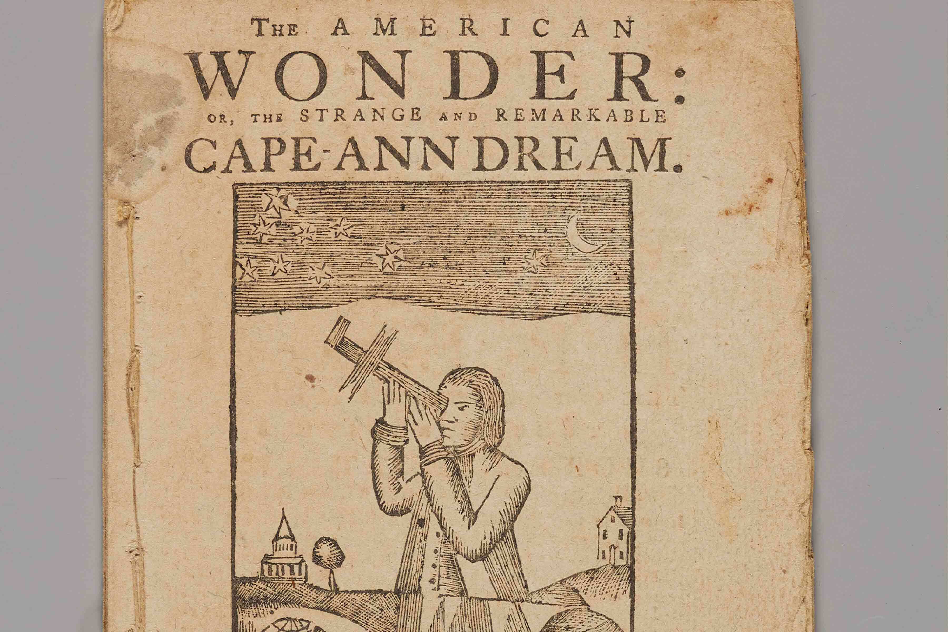
Samuel Clarke (most likely a pseudonym) and Ezekiel Russell, The American Wonder: or, The Strange and Remarkable Cape-Ann Dream, 1776. Ink on paper. Phillips Library, E209 .C53 1776
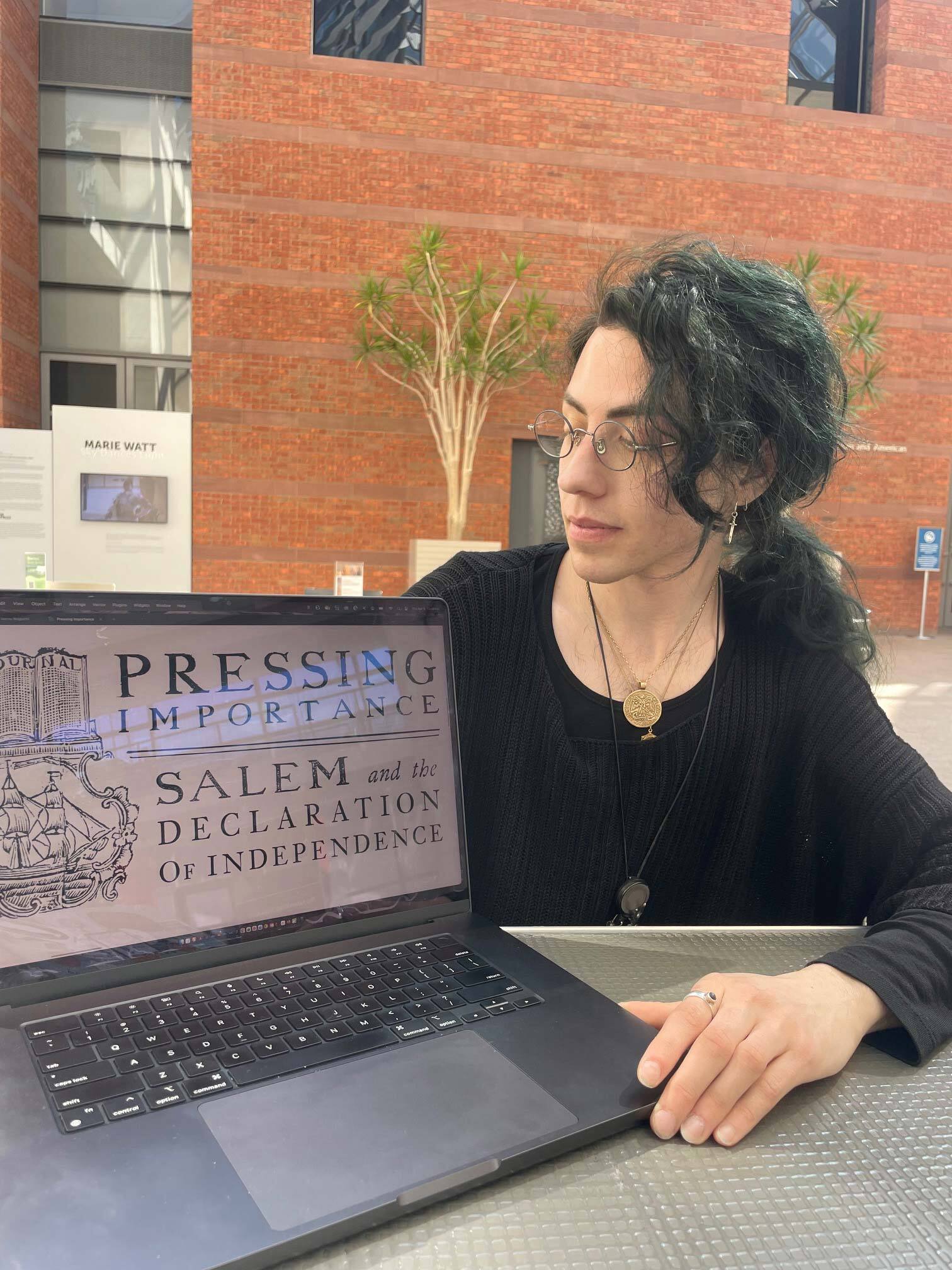
PEM Associate Design Director Mikhail Svetov shares about the making of the look and feel for the exhibition Pressing Importance: Salem and the Declaration of Independence. Photo by Dinah Cardin/PEM.
Q: First off, you live in Salem. Is this history, our city’s connection to the Declaration and the American Revolution, something you knew prior to being here at PEM? How does it make you see Salem's history differently?
A: I didn’t know about that history at all. It's very interesting to think that after the Declaration of Independence was signed, that the first person willing to stick his neck out and disseminate that information came to Salem. I'm from Massachusetts; I left and moved back specifically to the North Shore because I love the ocean. And I was very aware of Salem's importance as a port town, as a place that brought in spices, as a place with a long historical connection to bodies of water and trade. I never really thought of how vital it would be to have a hub like Salem disseminating this kind of revolutionary information. But it makes sense once you learn about it.
Q: Break down PEM's exhibition graphic design process for us.
A: First, we look at the overall big idea provided by the curatorial department for an exhibition. And then we workshop this big idea between our exhibition and marketing design teams. We think, in a few different ways, of how we translate it into a coherent visual experience. In this case, I asked myself the question: How did the materiality of early printmaking both relay and relate to the foundations of a nation? The marketing would need to address a visual response to this while catching people’s attention in a short moment — usually on a flat surface, like a screen or a print ad.
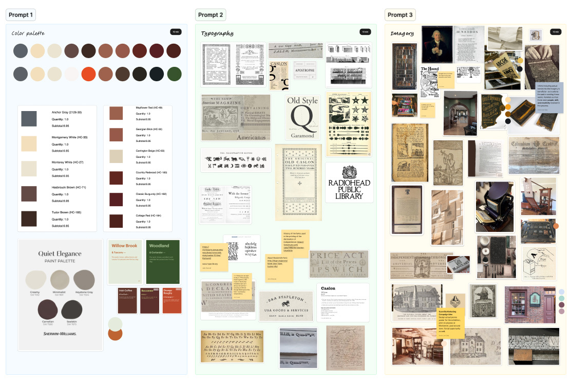
A working moodboard aligning early print references, materials, and typography to define the exhibition’s visual direction.
Q: What were some of the challenges you faced?
A: Something about this exhibition that we knew would be challenging from the start is the fact that we're talking about news and media from a very long time ago. We're talking about 250 years ago. Unless you have studied early printmaking in depth, simply the methods of spreading information and creating documents are wildly different from what we do in the modern day. There are no photos, no videos, no social media posts: we have individual hand-cut block letters that are being pressed. And that's why you see mismatched letter forms all the time in old documents, because it's not like they have a typewriter. There is a big wooden device that stamps things down and then they switch out the individual letters, letter by letter. So it is very different from what we're used to seeing.
We did think that we needed to conceptually come up with something that would garner the interest of people who are unfamiliar, and provide something new for people who are familiar.
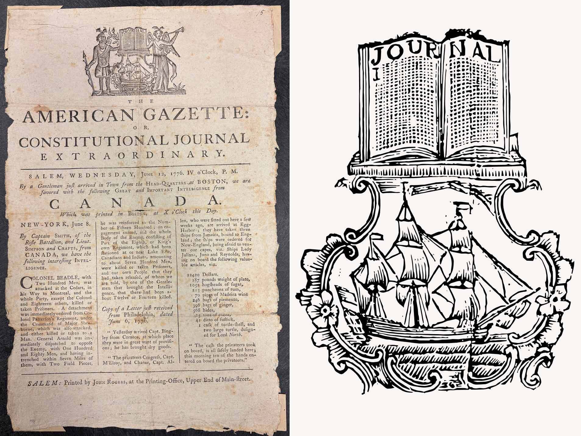
John Rogers and Ezekiel Russell, The American Gazette: or, The Constitutional Journal Extraordinary (with detail), June 12, 1776. Ink on paper. Phillips Library, Newspapers American Gazette 1776 June 12.
Q: How did you come up with the final design?
A: Our design teams came together on the digital equivalent of a whiteboard, and all pulled in a wide array of images, colors and articles that we felt were relevant to the exhibition. For example, we had a picture of the renovated Bell Inn and Tavern in Peabody. A few documents reference the original Bell Inn and Tavern as a revolutionary gathering spot that stood at the same site, and one even had a woodblock print. Most exhibitions use photography for marketing — but how do we make paper compelling and exciting? We do have woodblock prints, but this is an exhibition about very precious documents, about the dissemination of information and early printmaking. So we couldn't just focus on the woodcuts.
We have to use them where we can, but we also have to look at the context in which they're found. We ended up going in a direction where the emphasis is on the words, the name of the exhibition, the text and typesetting to make it reminiscent of those early documents with the imagery next to it, or sometimes as flourishes decorating it.
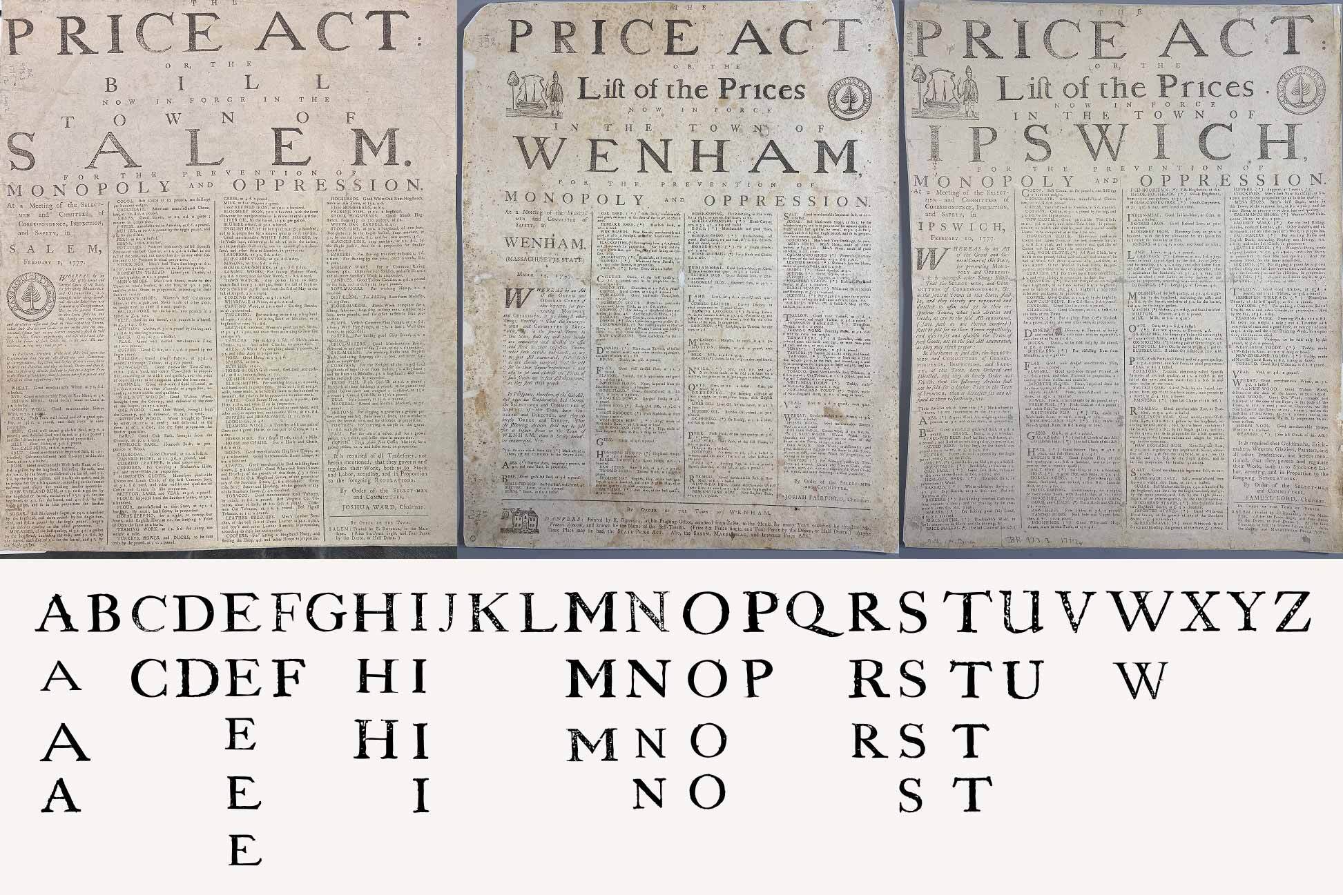
Select-Men and Committees in Salem, Wenham, and Ipswich, Massachusetts, and Ezekiel Russell, The Price Act ... Salem, February 1, 1777; The Price Act ... Wenham, March 14, 1777; and The Price Act ... Ipswich, February 10, 1777. All ink on paper, Phillips Library.
Q: How did you make an alphabet for the Pressing Importance logo, and which documents did you use?
A: We didn’t want to make our exhibition signage look like a cartoon ransom note by picking completely random letter forms. Historically, there was due diligence applied there, even though a lot of it was all done by hand. So we were thinking: how can we convey the evidence of the human hand being visible to people at a glance? PEM designers created a system of looking at the letter forms that were in the documents on view in the exhibition and pulling individual letters from works that had a similar heading.
There were a lot of price act documents throughout the North Shore announcing what could be the maximum price for things like wheat and sheep’s wool. So I was able to pull a nearly full, matching alphabet. (There was one from Ipswich, thankfully, so I could get that W.) We leaned into a few other documents for supplementary letters, from one honoring the life of a fallen soldier, to ones about the Declaration, or a farmer's almanac. Keep in mind, using too many sources all at once would've had us wind up with wildly different letter forms, especially because of how printers used to decorate a page in lieu of photography via text hierarchy or ornaments.
We wrote words letter by letter in a similar manner to what Ezekiel Russell would have done in his day, choosing alternates for repeating letters. For example, the letter S: If you look very closely in the documents, the same shape is used but discrepancies would occur where one has a bit more ink than the other. We applied this to our type, too.
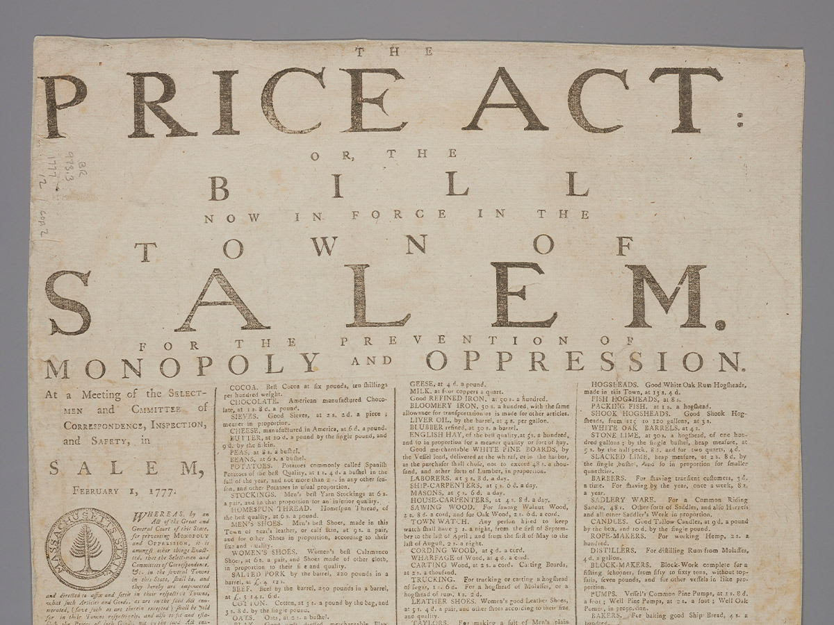
Select-Men and Committees in Salem, Massachusetts, and Ezekiel Russell, The Price Act: or, the Bill Now in Force in the Town of Salem, February 1, 1777. Ink on paper. Phillips Library, PS504 .E275 no.15590.
Q: You're kind of geeking out for the visually aware folks, right?
A: Yes, you have to, because some people will look for things like that! And when people aren't trained in it, they still will instinctively hunt for legibility. We want them to be able to read the text easily and think, “oh, this is historical. This is cool. That looks so neat.” But then you have people who've been trained in this and will think, “those E’s are different.” You want to be able to have something that can clearly and legibly express an idea. And at the same time, you want to find a spark of interest for people that hunt for those little quirks.
Q: Break it down for those of us who are not graphic designers. Is this a font?
A: It's not a font, no, because it’s not saved in a way where you can type it. Though if I wanted, I could at least make a rudimentary Latin alphabet font. But the thing with fonts and typefaces, is once you package one, load it into your computer, and start typing, it will simply repeat the same letters and follow a singular system of spacing. To achieve the same effect as Ezekiel Russell or his peers, where the spacing, letters, and even the amount of applied ink varies, I need to follow their example and line them up one by one. It’s tedious, but authentic.
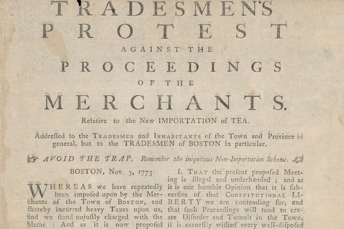
Ezekiel Russell, Tradesmen’s Protest Against the Proceedings of the Merchants, November 3, 1773. Collection of the Massachusetts Historical Society.
Q: How does this typography put people in the time and place of this exhibition?
A: We aimed to convey an early revolutionary movement through the lens of printmaking and material form: making it, disseminating it and then consuming it. What did information stand for? How did it feel? People may have seen historical printing presses in movies or popular culture, or they might see woodcut prints in fashion, or calligraphy. Our typographic approach aims to fill this void in many people's imaginations between what printing looks like in the late Renaissance and more automated printing methods.
Not to mention that media about the Revolution frequently portrays people sharing news in town squares, or fighting in battles. You don't see people putting blocks of text together by hand, or carving little soldiers and then stamping it.
Q: And yet, that was a very heroic, dangerous thing for them to do, right?
A: Yes. An amazing thing to do. The human spirit is imbued in all of the documents in this exhibition. I feel you can see just how much of the person is left behind in any piece of paper or information that was distributed on broadsides in that era. There is a booklet activity in the space centered on a reproduction of the press that should help communicate both scale and labor to visitors, too.
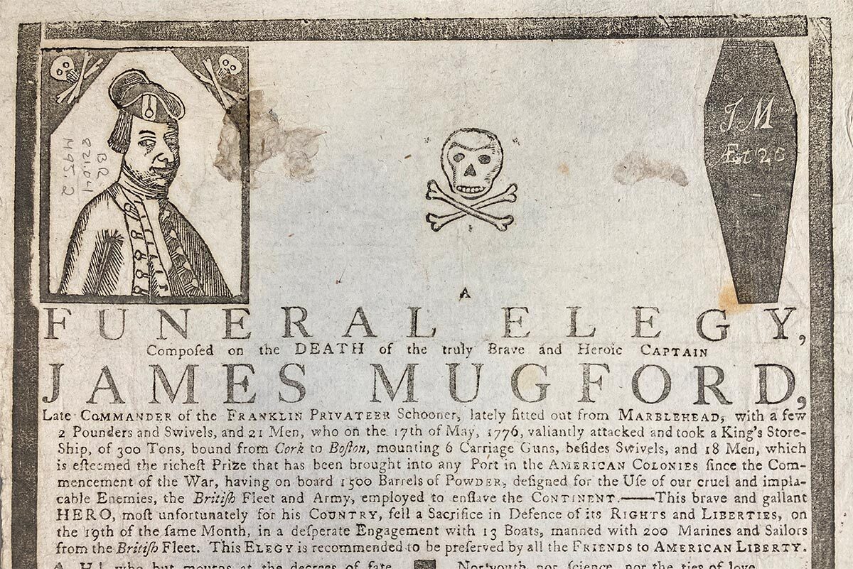
Ezekiel Russell, A Funeral Elegy, Composed on the Death of the Truly Brave and Heroic Captain James Mugford (detail), 1776. Ink on paper. Gift of James R. Baldwin, 1932. Phillips Library, E207.M84 F864.
Q: What surprised you while working on this project?
A: Some of the woodblock prints may look a little silly because the people who carved them weren’t exactly specialized artists — they were printmakers. You get to see a lot of unique visual expressions to convey information. I think that's quite precious. From simple carvings of George Washington, to illustrative decorations of coffins and crossed bones for elegies, or sketches of priests for funeral sermons. One pamphlet uses a stargazing woodcut to introduce a prophetic “Cape-Ann Dream.” It’s beautiful.
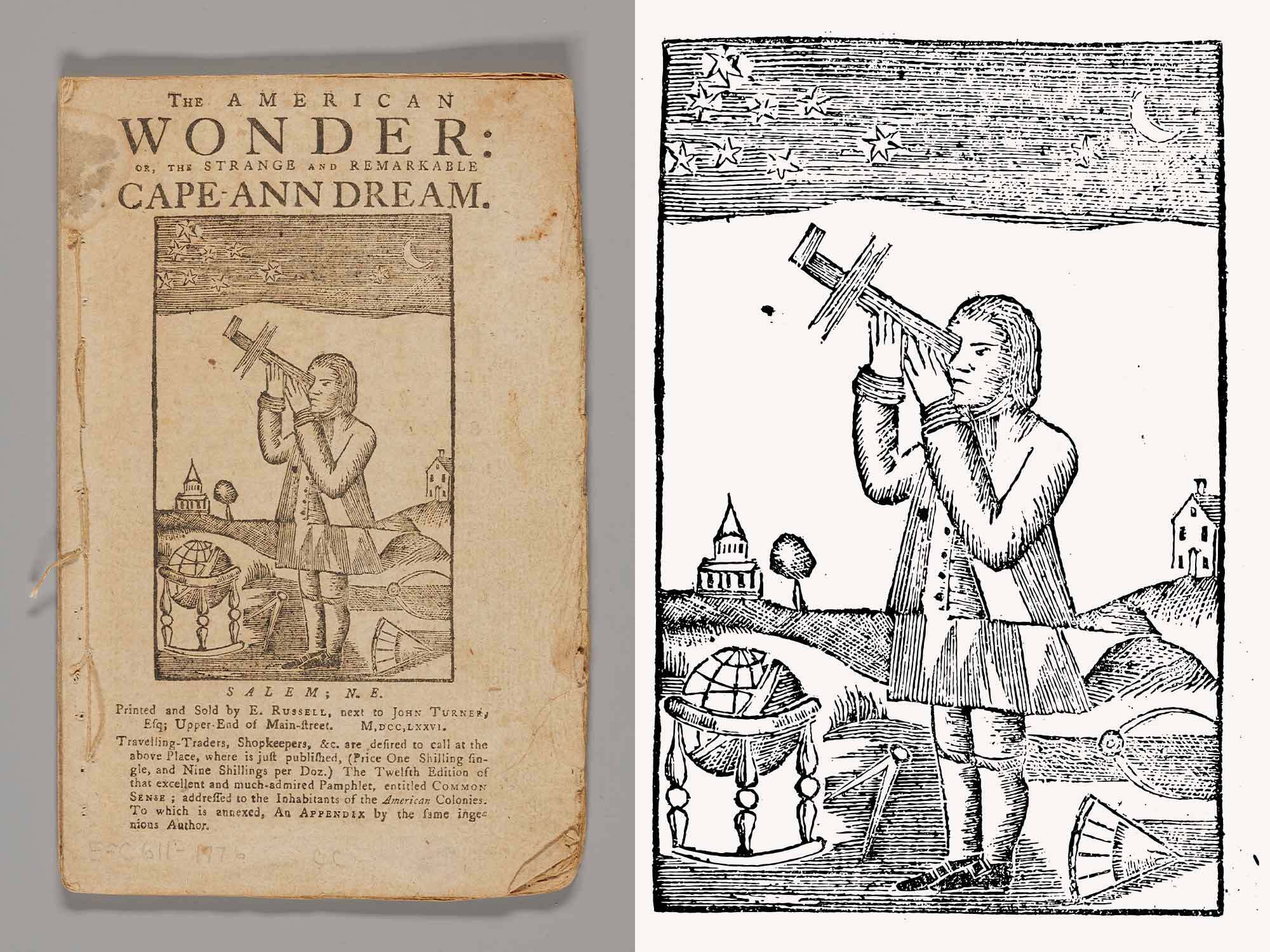
Samuel Clarke (most likely a pseudonym) and Ezekiel Russell, The American Wonder: or, The Strange and Remarkable Cape-Ann Dream, 1776. Ink on paper. Phillips Library, E209 .C53 1776
Q: What do you want the average person to know about the role of graphic design in our lives?
A: I'd love for anyone who is interested in design to think about the things they interact with on a daily basis. What do they read? What are the things that work well? There is a designer behind all of that, whether it’s text on a page, in an exhibit, on a website you visit, or in an app on your phone screen. Design plays a role in almost everything, and it’s not a simple matter of aesthetics. We are more inclined to use or engage with something when it makes sense to us in some way, when it appeals to us. Why does something feel easy to interact with? Usually, the answer is because it was designed to make you feel that way. Graphics and text often exist as the surface layers of these interactions. If you dig deeper into the role design plays in your life, you may be surprised by what you find.
Blog
PEM members vote on a new card design for 2026
2 min read
Press Release
PEM Exhibition Spotlights the 250th Anniversary of American Independence
Read on
Blog
Celebrating Rev 250 with PEM objects
8 Min read

Blog
PEM’s Phillips Library unlocks challenging 17th-century language and penmanship of the Salem witch trial documents
4 min read
